Role
Product Design, UX/UI
Project Type
Passion Project
Year
2022

FarmBox Mobile App
A mobile application which facilitates in the ordering and delivering of goods + produce from local farmers to nearby consumers.
About
FarmBox began as a design challenge and turned into a portfolio passion project.
The Problem
Local farmers have surplus produce that is going to waste. There is demand from consumers, but facilitation is needed.
Who would the users be?
The first thing I wanted to understand was who the target audience would be, and what targeted problems and needs each user group would have. I determined that there would be 3 primary user groups: consumers, farmers and delivery drivers. Next, I wrote user stories and goals for each of the user groups to help contextualize the perspectives of each of these groups.
Consumers
As a consumer I want to order fresh, local produce so that I can eat seasonal + nutritious food and support local farmers.
User Goals
-
learn about farms and items for sale nearby
-
order ingredients needed
-
understand costs
-
receive items in a timely manner

Farmers
As a farmer I want to sell my extra produce directly to local consumers so that I can maximize my profits and stay in business.
User Goals
-
list items for sale
-
share expiration / shelf life
-
manage inventory
-
schedule deliveries with drivers by co-ordinating dates/times
Drivers
As a driver I want to earn extra money during the timeframes my schedule allows so I can increase my overall income.
User Goals
-
apply for work on the platform
-
schedule pickups and deliveries
-
arrive at correct locations
-
understand how much money they can make / are making

* Having all three user perspectives accounted for was helpful context in thinking through what kind of experience I would create - however, for the purposes of this case study we will primarily focus on the experience of the consumer.
A closer look at the consumers' journey
Next, I wanted to try to understand the consumer target audience within the context of the product. I created an empathy map with the steps of:
-
needing groceries
-
discovering local farm options
-
downloading the app
-
exploring the app
-
and placing an order
I tried to put myself in the consumers' shoes and really understand what they could be thinking, doing, and feeling during each step in their journey.
Then I summarized the pain-points and goals of each step.

This exercise was super helpful in informing the direction of the design. Some of the major insights gained included:
-
Grocery shopping and meal planning in general can be very stressful and overwhelming, add onto that onboarding a new platform and shopping in an unfamiliar way and we had a potentially very stressful process for the user.
We wanted to make sure we guided them into the experience as much as possible.
-
Home page should be a hub for easy entry points into the experience - showing displays of seasonal items, bestsellers, and curated boxes.
-
A search feature should be one of the primary navigation options on the dock. Giving the user a consistently quick and easy access to find what they are looking for.
-
Because the level of effort associated with meal planning and grocery shopping is already high, I made the decision to allow users to bypass account registration before checking out the app. Though many competitors do not allow new users to do this, I felt this was important to help ease the barrier to entry for new users.
-
Meet Becca 👋
Once I had a better understanding of the consumer journey within the context of the product I crafted a proto-persona for the consumer user group: Becca.
-
I imagined our consumer would be a person who would feel good about themselves for supporting local farmers (because running to the store or using a grocery delivery service would be much more simple than using a product like this)
-
I envisioned them to be a fairly health-conscious consumer as they are looking for the freshest produce they can find.
-
I imagined they would be interested in other health-conscious activities like yoga and hiking.
I relied on my empathy map to inform her challenges and needs.
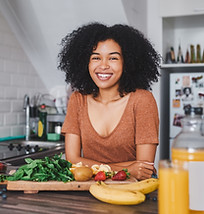
Becca / Consumer
Becca loves buying the freshest produce she can find + cooking new recipes. She enjoys yoga and hiking in her free time.
Health concsious
Shops local
Challenges + Needs
-
Meal + ingredient planning is time-consuming and takes effort
-
Needing other items that aren't offered to meal plan
-
Hard to remember when to order on-time from delivery apps to get orders on time.
-
Knowing how to work with new + seasonal ingredients
* For the purposes of this design challenge, I created a proto-persona, which differs from the more well-known traditional persona in that it is based on many assumptions. Ideally, and with more time I would have built out an in-detailed persona based on insights + demographics gathered through user research.
Task analyzing for the consumer
After gaining a better understanding of the customer as an end user, I started thinking through the specific goals and needs they would have when interacting with the app. I listed each need I could think of for the user, and then listed potential features for each task that could help them accomplish each goal.
AS A CUSTOMER
POTENTIAL SOLUTIONS
I need to....
The experience should offer...
See which types of produce are in season and available
Filtering options for in-season items, feature in-season items in a central location in the app
Discover farms near me
Search feature including map view to find nearby farms, use current location, and alter location
Request delivery or pickup
Toggle to switch between delivery vs. pickup, delivery address collection, time estimations for the different options, ability to expedite for an extra charge
Create an order + place an order
Dashboard with shopping filters + featured selections, a cart that will have items added to it, product cards with add to cart button, payment information collection
Learn more about products
Product details page with more information about items, tags for categories (i.e. organic, new)
Creating flows for consumer tasks
Once I had a pretty good idea of the most important tasks/goals for the consumer user group I started mapping out the user flows that would be necessary to allow them to accomplish said tasks/goals.


Entering the problem solving space
Once I had taken an in-depth exploration of the problem finding space - it was time to start getting ✨inspired✨
I began looking for apps and websites that were similar to a concept like FarmBox to conduct a competitive audit on.
The goals of my competitive audit were to:
-
Analyze the home pages, shop profile pages (if there were any), product detail pages, and navigation menu structures
-
See how others were solving the same design problems
-
Learn what competitors are doing + how they’re doing it
-
Find what’s working and what’s not
